They say a picture is worth a thousand words. A new campaign for McDonalds by TBWA Paris proves this statement true.
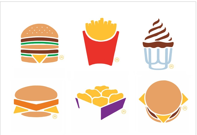
We live in an icon-driven world. (Think of your smart phone.) TBWA Paris took advantage of our icon-driven society and developed a simply beautiful campaign (emphasis on “simply”) for McDonalds. The campaign features six key McDonalds products illustrated in a clean, graphic-style nested in a field of white space. These illustrations speak for themselves, literally. The media they are featured on uses no headlines, copy or words of any kind.
This campaign relies on the strength of the vivid style of illustration, the consumer’s familiarity with McDonalds products and the fact that we have all become used to familiar things being represented in icon form. Being somewhat of an illustrator myself, I appreciate the simple, bold style that allows these products to be represented with the combination of a few simple shapes—that the products can be portrayed so simply and be recognizable speaks to the strength of the McDonalds brand.
It’s encouraging to see a company that’s been around for so long step out and take this bold, fresh approach to its advertising.
What do you think of the new McDonalds campaign? Does it resonate with you?