Ever try to visit a website, but closed out because it took too long to load? Or maybe you didn’t choose a brand because their website didn’t appeal to you? We’ve all done it. 94% of people say that website design impacts whether or not they trust a company. But design is just the beginning.
From aesthetics to content to usability, your hospital website is integral in influencing individuals in their hospital choice. It’s where people get a first impression, learn about your brand and see what services you offer. And if it’s working optimally, your website offers an opportunity for engagement and loyalty building. Invest in optimizing your website now for long-term ROI.

Here are 6 steps you need to take when investing in your hospital website:
1. Define the project – The amount of investment it will take to build an effective website is dependent on the needs of your current and existing website. Therefore, it’s important to determine whether your project will be a simple facelift or a complete redesign. Establishing a clear direction in the initial phase will be crucial in meeting the needs of your website and ensuring a clear process throughout the process.
Learn the difference between a website facelift and redesign. Then, determine what your needs are and which approach you will need for your hospital website:
- Facelift: It’s exactly what it sounds like; a website facelift focuses mainly on the aesthetics of your website. While the content structure of your website stays the same (navigation paths, page structures, sitemap, etc.), the look and feel of your website can completely transform. A facelift puts more attention on new fonts, a refreshed color theme, replacing logos, establishing a new brand standard. If the overall structure of your website makes sense and functions well, but you need to refresh the look of your page, consider giving your website a facelift.
- Redesign: If the entire architecture of your website structure needs to be reorganized, you may need to redesign your website. This means shifting your current navigation paths, building new pages and/or condensing existing pages, refocusing the overall look and feel or your website, etc. While this is a much more invested process, it’s better to build on a blank slate than to attempt a website facelift as a patching job for your current website. A redesign will prevent you from potential problems your website may face in the future.
If you determine that your hospital website requires a complete redesign, be sure to hire an experienced website partner who understands the healthcare industry and can help you rebuild an effective and functional hospital website. Starting from the ground up may seem overwhelming, but the investment will be worth it for the long run.
2. Make it mobile-friendly – Research shows that 1/3 of patients use tablets or mobile devices to research health information and/or book appointments. So what does that mean? Because a large percentage of patients and prospective patients will be accessing your website via a mobile device, your website needs to be responsive to the platform in which it is viewed, whether desktop, tablet or mobile. In fact, 74% of mobile users say they’re more likely to revisit mobile-friendly websites. In addition, Google is now penalizing websites that aren’t mobile-friendly, lowering their SEO ranking.
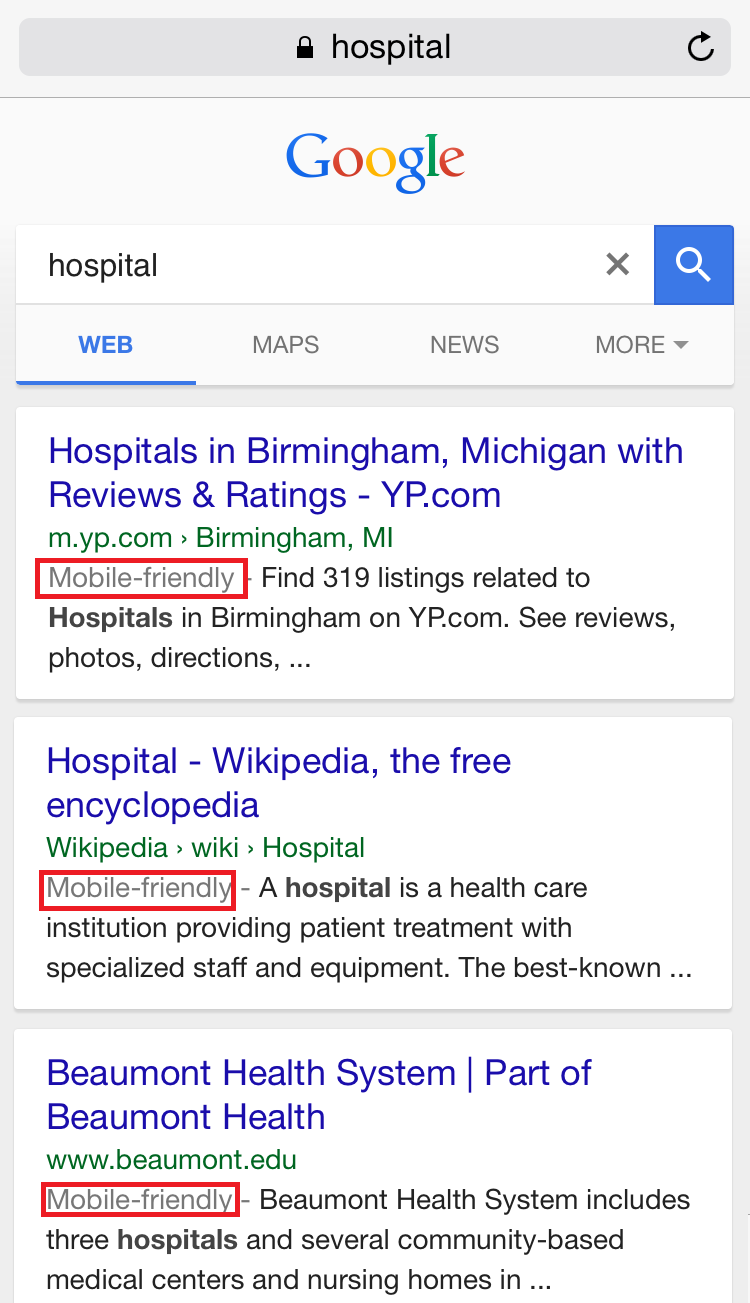
For example, when you search the word hospital in Google, the top results are all mobile-friendly:

3. Develop an SEO strategy – Search engine optimization (SEO) is a buzzword you’ve probably heard again and again. But what is it? And why does it matter? SEO refers to the process in how your website is ranked during an organic search. The higher a website is ranked on a search result page, the more likely it will drive traffic. So in order to increase your website visibility and avoid getting buried beneath other hospital websites, it’s important for your hospital to develop an effective SEO strategy.
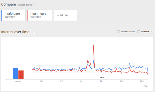
a. Establish keywords – It’s important to know what your audience is searching for. But it’s even more important to know how they’re searching for it. There are many phrases that could be used when performing a search, so which ones are the most common among your audience? Are they searching for endocrinology or diabetes? Doctor or physicians? Healthcare or health care? Google offers free tools like Google Trends and Google AdWords Planner to help you compare and analyze the most common words and phrases being used today among your target audience.

b. Aim for long tail keywords – Long tail keywords are phrases made up of 3-5 words. While they’re not as popular, they let you target a more specific audience and come with less competition with it comes to SEO ranking. For example, instead of choosing a keyword like “healthcare services,” focus on long tail terms such as “healthcare services in Michigan” or “healthcare services in Oakland County.”
You can always hire an SEO specialist who can help analyze your industry and develop an effective strategy, so you can optimize your search visibility.
4. Reinforce your brand – It’s important to keep your brand consistent, especially for a project as big as a website. And with so many people working on a large project, it’s easy for brand consistency to be overlooked. But from the tone of voice to the design of each page, your website should be cohesive.
Take time to establish a web-brand standards document that specifically describes:
a. Corporate colors
b. Logo usage
c. Font standards
d. Photographic standards
e. Graphic standards
f. Language and tone of voice
g. Copywriting guidelines
h. Website page templates
To ensure brand consistency across the entire website, this document should be distributed to any web content user with instruction for vigilant enforcement of the standards. See how Covenant HealthCare weaves their themeline, “Extraordinary care for every generation” throughout their entire website.
5. Avoid healthcare jargon – Rhinorrhea? Value-based care? Clinical integration? Chances are your website visitors don’t have the medical literacy that you do. So when creating website content, avoid using advanced medical terms and lean toward easy-to-understand laymen lingo. You can keep it simple, but still sound like an expert. Remember, they’re coming to you to learn more about their health and healthcare. So don’t assume they have the same knowledge that your team does. You might consider creating a glossary for some common, yet misunderstood, healthcare terminology.
6. Create simple calls-to-action (CTAs) – You got them to visit your page. But it’s just as important to get them to take an action once they are there. Including CTAs on your website is an important way to attract new visitors, generate more leads and gain patients. Plus, it’s a key asset for inbound marketing. Depending on your website content, CTA buttons can encourage users to:
a. Learn more
b. Contact
c. Visit us
d. Schedule an appointment
e. Download a whitepaper
f. Enroll in a webinar
g. Watch a video
h. Tell a friend
i. Pay your bill
j. Get directions
k. Make a donation
l. Volunteer
m. Share on social media
There are many ways you can increase engagement by including easy CTAs on your website.
Have you created a website for your hospital? Tell us what tips you’d like to add to our list in the comments below. Or if you’d like to learn more about creating a website for your hospital, contact our healthcare director, Julia Mastropaolo, at JMastropaolo@brogan.com.
Find more suggestions on how you can overcome hospital budget cuts.